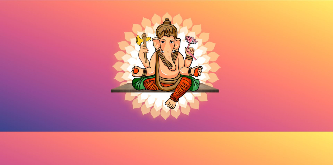
Hello friends, today we will make an animation of Lord Ganesha’s Aarti using html and css. So let’s start.
Step 01 :- Create a HTML file and put code in it .
HTML Code –This is not the complete code. I did not include the code because it is long. You can download the zip file below and you will get the complete code in it.
<!DOCTYPE html>
<html lang="en" >
<head>
  <meta charset="UTF-8">
  <title> Ganesh ji Aarti</title>
  <link rel='stylesheet' href='https://cdnjs.cloudflare.com/ajax/libs/twitter-bootstrap/4.1.3/css/bootstrap.min.css'><link rel="stylesheet" href="./style.css">

</head>
<body>
<div class="container">
  <div class="row">
    <div class="col-sm-12 col-md-12">
    <div class="divset">
      <svg class="rotate-center" version="1.1" xmlns="http://www.w3.org/2000/svg" xmlns:xlink="http://www.w3.org/1999/xlink" x="0px" y="0px"
	 viewBox="0 0 500 500" style="enable-background:new 0 0 500 500;" xml:space="preserve">
<style type="text/css">
	.st0{display:none;}
	.st1{display:inline;}
	.st2{clip-path:url(#SVGID_2_);fill:#F16F00;}
	.st3{display:inline;opacity:0.4;}
	.st4{fill:#FCC000;}
	.st5{opacity:0.8;}
	.st6{fill:#FED394;}
	.st7{display:none;opacity:0.8;}
	.st8{display:none;fill:#FFE8CC;}
	.st9{display:none;fill:#FFFFFF;}
	.st10{display:none;opacity:0.5;}
	.st11{display:inline;fill:#FFE8CC;}
	.st12{fill:#C15E42;}
	.st13{opacity:0.3;}
	.st14{opacity:0.4;fill:#C15E42;}
	.st15{opacity:0.2;}
	.st16{fill:#FFFFFF;}
	.st17{fill:#F3A203;}
	.st18{fill:#FFC44D;}
	.st19{opacity:0.3;fill:#FFFFFF;}
	.st20{display:inline;fill:#C15E42;}
	.st21{font-family:'KaushanScript-Regular';}
	.st22{font-size:42.7014px;}
	.st23{display:inline;fill:#F3A203;}
	.st24{font-family:'PlayfairDisplay-Bold';}
	.st25{font-size:13.0421px;}
	.st26{letter-spacing:8;}
</style>
<g id="BACKGROUND" class="st0">
	<g class="st1">
		<defs>
			<rect id="SVGID_1_" width="500" height="500"/>
		</defs>
		<use xlink:href="#SVGID_1_"  style="overflow:visible;fill:#F16F00;"/>
		<clipPath id="SVGID_2_">
			<use xlink:href="#SVGID_1_"  style="overflow:visible;"/>
		</clipPath>
		<rect x="-42" y="-40" class="st2" width="586" height="585"/>
	</g>
</g>

      <img class="img_two rotate-center-sec"  src="https://1.bp.blogspot.com/-zbTJP7CFU1o/XXiYo8bj14I/AAAAAAAATLc/YgdiMIILXq0LwaDbbyN-0Ew9katTRDUQQCLcBGAsYHQ/s1600/second_circle.png" alt="Smiley face" height="800px" width="800px">

        <img class="img_three rotate-center-third"  src="https://1.bp.blogspot.com/-_COGVBH4WyY/XXijt_rn5FI/AAAAAAAATL0/sCQhgcmjUl8amPCCquFtjEmmsxc_y_fyACLcBGAsYHQ/s1600/circle_third.png" alt="Smiley face" height="500px" width="500px">

      <div>
<img class="ganeshJee" src="https://i.postimg.cc/wxFc2PZ6/Ganesh.png" height="500px" width="500px">
</div>
      </div>
    </div>
  </div>
</div>


</body>
</html>
Step 02 :- Create another file and named it style.css and put style code in it.
CSS Code –
body
{
  margin:0;
  padding:0;
  background-image: -webkit-gradient(linear, left bottom, right top, from(#38438b), color-stop(#944b94), color-stop(#d75a88), color-stop(#ff7e71), color-stop(#ffb25f), to(#ffeb68));
    background-image: -webkit-linear-gradient(left bottom, #38438b, #944b94, #d75a88, #ff7e71, #ffb25f, #ffeb68);
    background-image: -o-linear-gradient(left bottom, #38438b, #944b94, #d75a88, #ff7e71, #ffb25f, #ffeb68);
    background-image: linear-gradient(to right top, #38438b, #944b94, #d75a88, #ff7e71, #ffb25f, #ffeb68);
}
.divset
{
  overflow: hidden;
    height: 800px;
    width: 800px;
    margin:-20px auto;
}

.rotate-center {
	-webkit-animation: rotate-center 4s linear infinite both;
	        animation: rotate-center 4s linear infinite both;
}
.img_one
{
  position: absolute;
   top: 30%;
   left: 50%;
   width: 700px;
   height: 700px;
   margin-top: -250px; /* Half the height */
   margin-left: -250px;
}

.img_two
{
     position: absolute;
    top: 50%;
    left: 50%;
    width: 530px;
    height: 530px;
    margin-top: -258px;
    margin-left: -268px;
}
.img_three
{
     position: absolute;
    top: 50%;
    left: 50%;
    width: 470px;
    height: 470px;
    margin-top: -220px;
    margin-left: -233px;
}
@-webkit-keyframes rotate-center {
  0% {
    -webkit-transform: rotate(0);
            transform: rotate(0);
  }
  100% {
    -webkit-transform: rotate(360deg);
            transform: rotate(360deg);
  }
}
@keyframes rotate-center {
  0% {
    -webkit-transform: rotate(0);
            transform: rotate(0);
  }
  100% {
    -webkit-transform: rotate(360deg);
            transform: rotate(360deg);
  }
}
.rotate-center-sec {
	-webkit-animation: rotate-center-re 6s linear infinite reverse both;
	        animation: rotate-center-re 6s linear infinite reverse both;
}
@-webkit-keyframes rotate-center-re {
  0% {
    -webkit-transform: rotate(0);
            transform: rotate(0);
  }
  100% {
    -webkit-transform: rotate(360deg);
            transform: rotate(360deg);
  }
}
@keyframes rotate-center-re {
  0% {
    -webkit-transform: rotate(0);
            transform: rotate(0);
  }
  100% {
    -webkit-transform: rotate(360deg);
            transform: rotate(360deg);
  }
}
.rotate-center-third {
	-webkit-animation: rotate-center-th 10s linear infinite both;
	        animation: rotate-center-th 10s linear infinite both;
}
@-webkit-keyframes rotate-center-th {
  0% {
    -webkit-transform: rotate(0);
            transform: rotate(0);
  }
  100% {
    -webkit-transform: rotate(360deg);
            transform: rotate(360deg);
  }
}
@keyframes rotate-center-th {
  0% {
    -webkit-transform: rotate(0);
            transform: rotate(0);
  }
  100% {
    -webkit-transform: rotate(360deg);
            transform: rotate(360deg);
  }
}
.ganeshJee
{
 position: absolute;
    top: 50%;
    left: 50%;
    width: 730px;
    height: 730px;
    margin-top: -395px;
    margin-left: -360px;
    animation: bounce 5s ease-in-out infinite;
}

@media only screen and (max-width: 600px) {
  svg{width:750px;
    left:0; position: absolute;
    margin-left:-60%;
    margin-top:10%;top:0;

  }
}
@keyframes bounce {
    0%, 100% {
        transform: translateY(0);
    }
    30% {
        transform: translateY(-5px);
    }
    50% {
        transform: translateY(5px);
    }
    70% {
        transform: translateY(-5px);
    }
}
OutPut :-