Hello friends, in today’s blog we will clone Amazon website using only HTML and CSS.
Share my website with all your friends because I upload daily amazing projects with source code.
When you make a website then you should use specific tags for specific things like <head>, <header> tag for header. <nav> tag for navbar. <aside> for aside. <article> tag for article. <main> tag for main content. <section> tag for any section. <p> tag for paragraph. What will happen with these tags is that it will be easy for google crawler to understand the content of your website and your website will rank.
01. HTML File :-
<!DOCTYPE html>
<html lang="en">
<head>
<meta charset="UTF-8">
<meta name="viewport" content=
"width=device-width, initial-scale=1.0">
<link rel="stylesheet" href="style.css">
<link rel="stylesheet" href=
"https://cdnjs.cloudflare.com/ajax/libs/font-awesome/6.5.1/css/all.min.css" integrity=
"sha512-DTOQO9RWCH3ppGqcWaEA1BIZOC6xxalwEsw9c2QQeAIftl+Vegovlnee1c9QX4TctnWMn13TZye+giMm8e2LwA=="
crossorigin="anonymous" referrerpolicy="no-referrer" />
<title>Amazon Clone</title>
</head>
<body>
<header>
<nav>
<div class="nav-left">
<div class="nav-logo">
<image src="logo.png"></image>
</div>
<div class="location">
<p class="top-text">Deliver to</p>
<div class="location-icon">
<i class="fa-solid fa-location-dot"></i>
<p class="bottom-text">India</p>
</div>
</div>
</div>
<div class="nav-center">
<select class="search-dropdown">
<option>All</option>
<option>All Departments</option>
<option>Arts & Crafts</option>
</select>
<input type="text" placeholder="Search Amazon"
class="search-box">
<div class="search-icon">
<i class="fa-solid fa-magnifying-glass"
style="color: #28416c;">
</i>
</div>
</div>
<div class="nav-right">
<div class="language-option">
<div class="flag">
<i class="fa-regular fa-flag"></i>
</div>
<select class="select-language">
<option value="lan">EN</option>
<option value="lan">ES</option>
<option value="lan">AR</option>
</select>
</div>
<div class="account-option">
<p class="top-text">
Hello, sign in
</p>
<select class="select-account">
<option value="Account">
Account & Lists
</option>
<option value="Account">
Account & Lists
</option>
<option value="Account">
Account & Lists
</option>
</select>
</div>
<div class="order-option">
<p class="top-text">
Returns
</p>
<p class="bottom-text">
& Orders
</p>
</div>
<div class="cart-option">
<div class="cart-logo">
<i class="fa-solid fa-cart-shopping"></i>
</div>
Cart
</div>
</div>
</nav>
<div class="nav-options">
<div class="all-logo">
<i class="fa-solid fa-bars"></i>
<p class="list">All</p>
</div>
<div class="options">
<p>Today's Deals</p>
<p>Customer Service</p>
<p>Registry</p>
<p>Gift Cards</p>
<p> Sell</p>
</div>
</div>
</header>
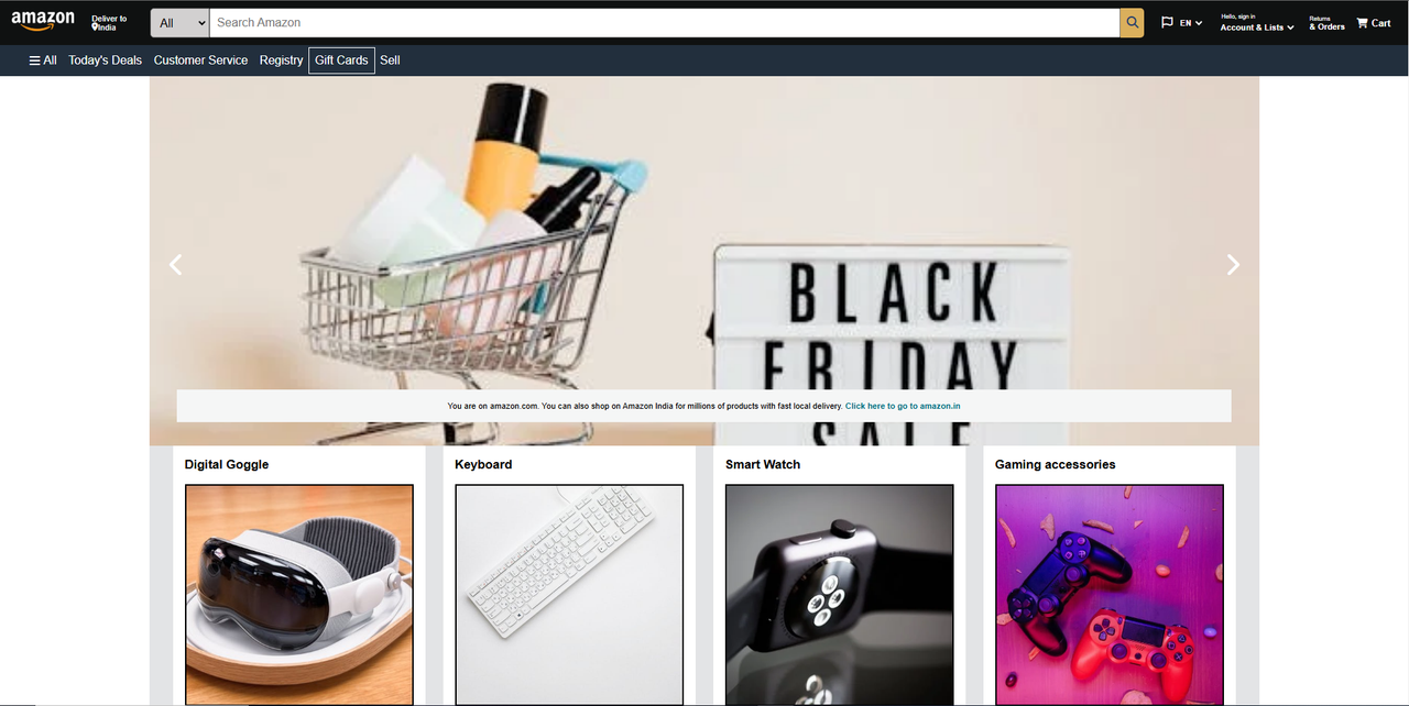
<main>
<div class="carousel">
<div class="slides-container">
<div id="slide1" class="slide">
<div class="content">
<image src="https://images.pexels.com/photos/5650050/pexels-photo-5650050.jpeg?auto=compress&cs=tinysrgb&w=600"></image>
<div></div>
</div>
<a href="#slide3" class="prev arrow">
<i class="fa-solid fa-chevron-left"
style="color: #ffffff;">
</i>
</a>
<a href="#slide2" class="next arrow">
<i class="fa-solid fa-chevron-right"
style="color: #ffffff;">
</i>
</a>
</div>
<div id="slide2" class="slide">
<div class="content">
<image src="banner2.jpeg"></image>
</div>
<div class="arrows"></div>
<a href="#slide1" class="prev arrow">
<i class="fa-solid fa-chevron-left"
style="color: #ffffff;">
</i>
</a>
<a href="#slide3" class="next arrow">
<i class="fa-solid fa-chevron-right"
style="color: #ffffff;">
</i>
</a>
</div>
<div id="slide3" class="slide">
<div class="content">
<image src="banner3.jpeg"></image>
</div>
<div class="arrows"></div>
<a href="#slide2" class="prev arrow">
<i class="fa-solid fa-chevron-left"
style="color: #ffffff;">
</i>
</a>
<a href="#slide1" class="next arrow">
<i class="fa-solid fa-chevron-right"
style="color: #ffffff;">
</i>
</a>
</div>
</div>
<div class="text">
<p>
You are on amazon.com. You can also shop
on Amazon India for millions of products
with fast local delivery.
<a href="#">
Click here to go to amazon.in
</a>
</p>
</div>
</div>
<div class="items-container">
<div class="item-card">
<h2>Digital Goggle</h2>
<image src="https://images.pexels.com/photos/29073142/pexels-photo-29073142/free-photo-of-futuristic-virtual-reality-headset-on-display.jpeg?auto=compress&cs=tinysrgb&w=600"></image>
<p>
<a href="#">See more</a>
</p>
</div>
<div class="item-card">
<h2>Keyboard<h2>
<image src="https://images.pexels.com/photos/1772123/pexels-photo-1772123.jpeg?auto=compress&cs=tinysrgb&w=600"></image>
<p>
<a href="#">See more</a>
</p>
</div>
<div class="item-card">
<h2>Smart Watch </h2>
<image src="https://images.pexels.com/photos/437036/pexels-photo-437036.jpeg?auto=compress&cs=tinysrgb&w=600"></image>
<p>
<a href="#">See more</a>
</p>
</div>
<div class="item-card">
<h2>Gaming accessories</h2>
<image src="https://images.pexels.com/photos/7776896/pexels-photo-7776896.jpeg?auto=compress&cs=tinysrgb&w=600"></image>
<p>
<a href="#">See more</a>
</p>
</div>
<div class="item-card">
<h2>Vision Pro</h2>
<image src="product5.jpg"></image>
<p>
<a href="#">See more</a>
</p>
</div>
<div class="item-card">
<h2>Top Deal</h2>
<image src="https://images.pexels.com/photos/373541/pexels-photo-373541.jpeg?auto=compress&cs=tinysrgb&w=600"></image>
<p>
<a href="#">See more</a>
</p>
</div>
<div class="item-card">
<h2>Chairs</h2>
<image src="https://images.pexels.com/photos/2762247/pexels-photo-2762247.jpeg?auto=compress&cs=tinysrgb&w=600"></image>
<p>
<a href="#">See more</a>
</p>
</div>
<div class="item-card">
<h2>Camera</h2>
<image src="https://images.pexels.com/photos/243757/pexels-photo-243757.jpeg?auto=compress&cs=tinysrgb&w=1260&h=750&dpr=1"></image>
<p>
<a href="#">See more</a>
</p>
</div>
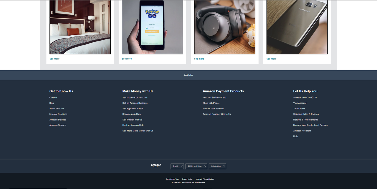
<div class="item-card">
<h2>bed</h2>
<image src="https://images.pexels.com/photos/164595/pexels-photo-164595.jpeg?auto=compress&cs=tinysrgb&w=1260&h=750&dpr=1"></image>
<p>
<a href="#">See more</a>
</p>
</div>
<div class="item-card">
<h2>Gaming mobile</h2>
<image src="https://images.pexels.com/photos/163042/pokemon-pokemon-go-mobile-trends-smartphone-163042.jpeg?auto=compress&cs=tinysrgb&w=1260&h=750&dpr=1"></image>
<p>
<a href="#">See more</a>
</p>
</div>
<div class="item-card">
<h2>Earphone</h2>
<image src="https://images.pexels.com/photos/2046807/pexels-photo-2046807.jpeg?auto=compress&cs=tinysrgb&w=1260&h=750&dpr=1"></image>
<p>
<a href="#">See more</a>
</p>
</div>
<div class="item-card">
<h2>Samsung</h2>
<image src="https://images.pexels.com/photos/214488/pexels-photo-214488.jpeg?auto=compress&cs=tinysrgb&w=1260&h=750&dpr=1"></image>
<p>
<a href="#">See more</a>
</p>
</div>
</div>
</main>
<footer>
<a href="#" class="back-option">
Back to top
</a>
<div class="footer-links">
<ul>
<p>Get to Know Us</p>
<a>Careers</a>
<a>Blog</a>
<a>About Amazon</a>
<a>Investor Relations</a>
<a>Amazon Devices</a>
<a>Amazon Science</a>
</ul>
<ul>
<p>Make Money with Us</p>
<a>Sell products on Amazon</a>
<a>Sell on Amazon Business</a>
<a>Sell apps on Amazon</a>
<a>Become an Affiliate</a>
<a>Self-Publish with Us</a>
<a>Host an Amazon Hub</a>
<a>See More Make Money with Us</a>
</ul>
<ul>
<p>Amazon Payment Products</p>
<a>Amazon Business Card</a>
<a>Shop with Points</a>
<a>Reload Your Balance</a>
<a>Amazon Currency Converter</a>
</ul>
<ul>
<p>Let Us Help You</p>
<a>Amazon and COVID-19</a>
<a>Your Account</a>
<a>Your Orders</a>
<a>Shipping Rates & Policies</a>
<a>Returns & Replacements</a>
<a>Manage Your Content and Devices</a>
<a>Amazon Assistant</a>
<a>Help</a>
</ul>
</div>
<div class="country-info">
<div class="logo">
<image src="logo.png"></image>
</div>
<div class="options">
<select>
<option value="En">
English
</option>
</select>
<select>
<option value="1">
$ USD - U.S. Dollar
</option>
</select>
<select>
<option value="4">
United states
</option>
</select>
</div>
</div>
<div class="policies">
<div class="pages">
<a href="#">Conditions of Use</a>
<a href="#">Privacy Notice</a>
<a href="#">Your Ads Privacy Choices</a>
</div>
© 1996-2023, Amazon.com, Inc. or its affiliates
</div>
</footer>
</body>
</html>
02. CSS File :-
* {
margin: 0;
padding: 0;
box-sizing: border-box;
}
body {
height: 100vh;
font-family: Arial;
}
nav {
height: 60px;
display: flex;
align-items: center;
background-color: #0f1111;
color: white;
}
.nav-left {
display: flex;
align-items: center;
justify-content: center;
margin-left: .5rem;
}
.nav-logo img {
width: 100px;
padding: .5rem;
}
.nav-logo:hover {
outline: 1px solid white;
}
.location {
height: 100%;
font-size: .7rem;
padding: .5rem 1rem;
}
.location:hover {
outline: 1px solid white;
}
.location-icon {
display: flex;
align-items: center;
}
.nav-center {
height: 40px;
display: flex;
flex-grow: 1;
border-radius: 5px;
margin-left: 1rem;
}
.nav-center:hover {
outline: 2px solid rgb(232, 176, 73);
}
.search-dropdown {
width: 5rem;
font-size: 1rem;
background-color: rgb(210, 208, 208);
padding: .5rem;
border-radius: 5px 0 0 5px;
outline: none;
}
.search-dropdown:focus {
outline: none;
}
.search-box {
font-size: 1rem;
flex-grow: 1;
padding: .5rem;
}
.search-box:focus {
outline: none;
}
.search-icon i {
height: 100%;
background-color: rgba(255, 203, 105, 0.849);
border-radius: 0 5px 5px 0;
padding: .7rem .5rem;
outline: none;
}
.nav-right {
display: flex;
align-items: center;
margin: 0 1rem;
}
.language-option {
display: flex;
padding: .5rem .5rem;
}
.language-option:hover {
outline: 1px solid white;
}
.flag {
width: 20px;
}
.select-language {
font-size: .7rem;
font-weight: bold;
color: white;
background: transparent;
border: none;
}
.select-language option {
color: black;
}
.account-option {
padding: .5rem .5rem;
}
.account-option:hover {
outline: 1px solid white;
}
.account-option .top-text {
font-size: .5rem;
margin-left: 5px;
}
.select-account {
font-size: .7rem;
font-weight: bold;
background: transparent;
color: white;
border: none;
}
.order-option {
padding: .5rem .5rem;
}
.order-option:hover {
outline: 1px solid white;
}
.order-option .top-text {
font-size: .5rem;
}
.order-option .bottom-text {
font-size: .7rem;
font-weight: bold;
}
.cart-option {
display: flex;
align-items: center;
font-size: 0.8rem;
font-weight: 700;
padding: .5rem .5rem;
}
.cart-option:hover {
outline: 1px solid white;
}
.cart-logo i {
width: 20px;
}
.nav-options {
height: 42px;
display: flex;
align-items: center;
background-color: #222f3d;
color: white;
justify-content: start;
}
.nav-options * {
cursor: pointer;
}
.all-logo {
display: flex;
align-items: center;
gap: .3rem;
padding: .5rem;
margin-left: 2rem;
}
.all-logo:hover {
outline: 1px solid white;
}
.nav-options .options {
display: flex;
}
.nav-options .options p {
padding: 0.5rem;
}
.nav-options .options p:hover {
outline: 1px solid white;
}
main {
width: min(1500px, 100%);
position: relative;
left: 50%;
transform: translate(-50%);
}
.carousel {
width: 100%;
height: 500px;
position: relative;
display: flex;
justify-content: center;
align-items: flex-end;
}
.carousel .slides-container {
position: absolute;
top: 0;
right: 0;
bottom: 0;
left: 0;
display: flex;
overflow-x: scroll;
scroll-snap-type: x mandatory;
}
.carousel .slides-container::-webkit-scrollbar {
display: none;
}
.slides-container .slide {
position: relative;
display: flex;
align-items: center;
justify-content: center;
flex: 0 0 100%;
overflow: hidden;
}
.slide .content {
width: 100%;
height: 100%;
}
.slide .content img {
height: 100%;
width: 100%;
object-fit: cover;
}
.slide .arrow {
position: absolute;
top: 50%;
transform: translateY(-50%);
scale: 2;
margin: 1rem;
}
.slide .prev {
left: 1rem;
}
.slide .next {
right: 1rem;
}
.carousel .text {
width: 95%;
position: absolute;
text-align: center;
font-size: .7rem;
background-color: #f5f6f6;
padding: 1rem;
margin-bottom: 2rem;
}
.carousel .text a {
text-decoration: none;
font-weight: bold;
color: #007185;
}
.items-container {
display: flex;
flex-wrap: wrap;
gap: 1.5rem;
background-color: #c9cbcf82;
padding: 0 2rem 2rem 2rem;
}
.item-card {
height: 400px;
display: flex;
flex-direction: column;
flex: 1 0 300px;
gap: 1rem;
font-size: .7rem;
background-color: white;
padding: 1rem;
cursor: pointer;
overflow: hidden;
}
.item-card img {
height: 300px;
width: 100%;
border: 2px solid black;
object-fit: cover;
}
.item-card a {
text-decoration: none;
font-weight: bold;
color: #007185;
}
/* Footer */
.back-option {
text-decoration: none;
height: 50px;
display: flex;
align-items: center;
justify-content: center;
font-size: .5rem;
font-weight: bold;
color: white;
background-color: #37475A;
}
.footer-links {
height: 400px;
display: flex;
justify-content: space-evenly;
background-color: #232F3E;
color: white;
}
.footer-links ul {
margin-top: 3rem;
}
.footer-links ul p {
font-weight: bold;
}
.footer-links ul a {
display: block;
font-size: .7rem;
color: #dddddd;
margin-top: 1rem;
cursor: pointer;
}
.footer-links ul a:hover {
text-decoration: underline;
}
.country-info {
height: 70px;
display: flex;
align-items: center;
justify-content: center;
background-color: #232F3E;
color: white;
border-top: 0.5px solid #84868878;
}
.country-info .logo img {
width: 50px;
}
.country-info .options {
display: flex;
gap: .5rem;
margin-left: 3rem;
}
.country-info .options select {
font-size: .5rem;
text-decoration: none;
color: #cccccc;
background: transparent;
border: 1px solid #848688;
border-radius: 3px;
padding: .5rem;
}
.policies {
height: 80px;
display: flex;
flex-direction: column;
align-items: center;
justify-content: center;
gap: .5rem;
font-size: .5rem;
color: white;
background-color: #131A22;
}
.pages a {
text-decoration: none;
color: white;
margin-left: 1rem;
}
@media screen and (max-width: 900px) {
:root {
font-size: 2vw;
}
nav {
height: 5vw;
}
.nav-logo img {
width: 7vw;
}
.nav-center {
height: 4vw;
}
.search-dropdown {
width: 7vw;
}
.search-box {
width: 1vw;
}
.search-icon i {
padding: .5rem .5rem;
}
.flag {
width: 2vw;
}
.cart-logo {
width: 3vw;
}
.nav-options {
height: 5vw;
}
.carousel {
height: 30vw;
}
.arrow i {
height: 4vw;
}
.item-card {
height: 25vw;
flex: 1 0 20vw;
font-size: .5rem;
}
.item-card img {
height: 14vw;
}
/* Footer */
.back-option {
height: 5vw;
}
.footer-links {
height: 40vw;
}
.country-info .logo img {
width: 7vw;
}
.policies {
height: 8vw;
}
}
OutPut :-
Download Ebooks – Click Me
Download Notes – Click Me


