Hello friends my name is Rahul and today I will tell you how you can create a travel/tourism booking website with the help of HTML and CSS.
First of all you have to link the HTML and CSS files.Using the link tag.
01. HTML File :-
<link rel="stylesheet" href="style.css">
<body>
<!--===========Nav Bar=================-->
<section class="nav-bar">
<div class="logo">Out.sider</div>
<ul class="menu">
<li><a href="#">home</a></li>
<li><a href="#">tours</a></li>
<li><a href="#">package</a></li>
<li><a href="#">blog</a></li>
<li><a href="#">about us</a></li>
<li><a href="#">contact us</a></li>
</ul>
</div>
</section>
<!--===============Banner================-->
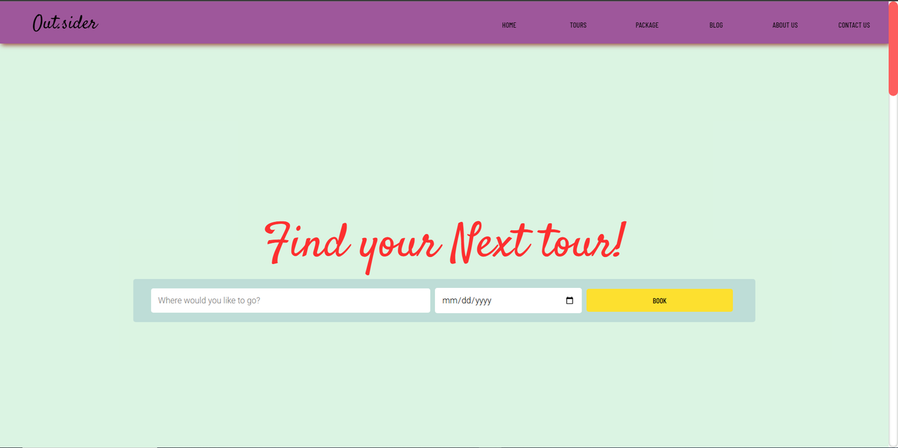
<section class="banner">
<div class="banner-text-item">
<div class="banner-heading">
<h1>Find your Next tour!</h1>
</div>
<form class="form">
<input type="text" list="mylist" placeholder="Where would you like to go?">
<datalist id="mylist">
<option>London</option>
<option>Canada</option>
<option>Monaco</option>
<option>France</option>
<option>Japan</option>
<option>Switzerland</option>
<option>Seoul</option>
</datalist>
<input type="date" class="date">
<a href="#" class="book">book</a>
</form>
</div>
</section>
<!--=========Services===============-->
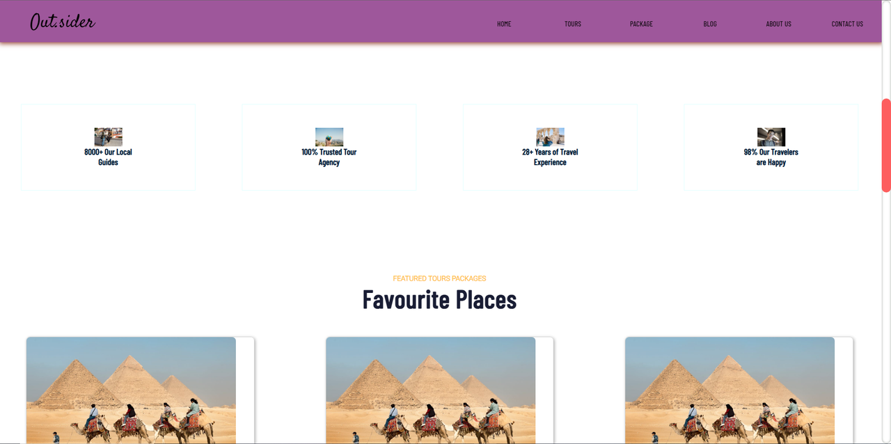
<section class="services">
<div class="service-item">
<img src="https://images.pexels.com/photos/6181105/pexels-photo-6181105.jpeg?auto=compress&cs=tinysrgb&w=1260&h=750&dpr=1">
<h2>8000+ Our Local Guides</h2>
</div>
<div class="service-item">
<img src="https://images.pexels.com/photos/346885/pexels-photo-346885.jpeg?auto=compress&cs=tinysrgb&w=1260&h=750&dpr=1">
<h2>100% Trusted Tour Agency</h2>
</div>
<div class="service-item">
<img src="https://images.pexels.com/photos/2087391/pexels-photo-2087391.jpeg?auto=compress&cs=tinysrgb&w=1260&h=750&dpr=1">
<h2>28+ Years of Travel Experience</h2>
</div>
<div class="service-item">
<img src="https://images.pexels.com/photos/3799223/pexels-photo-3799223.jpeg?auto=compress&cs=tinysrgb&w=1260&h=750&dpr=1">
<h2>98% Our Travelers are Happy</h2>
</div>
</section>
<!--==============Places===================-->
<section class="places">
<div class="places-text">
<small>FEATURED TOURS PACKAGES</small>
<h2>Favourite Places</h2>
</div>
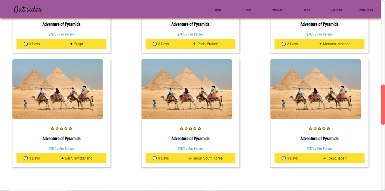
<div class="cards">
<div class="card">
<div class="zoom-img">
<div class="img-card">
<img src="https://images.pexels.com/photos/3522880/pexels-photo-3522880.jpeg?auto=compress&cs=tinysrgb&w=1260&h=750&dpr=1">
</div>
</div>
<div class="text">
<span class="rating">⭐⭐⭐⭐⭐</span>
<h2> Adventure of Pyramids</h2>
<p class="cost">$1870 / Per Person</p>
<div class="card-box">
<p class="time">🕓 3 Days</p>
<p class="location">✈ Egypt</p>
</div>
</div>
</div>
<div class="card">
<div class="zoom-img">
<div class="img-card">
<img src="https://images.pexels.com/photos/3522880/pexels-photo-3522880.jpeg?auto=compress&cs=tinysrgb&w=1260&h=750&dpr=1">
</div>
</div>
<div class="text">
<span class="rating">⭐⭐⭐⭐⭐</span>
<h2>Adventure of Pyramids</h2>
<p class="cost">$1870 / Per Person</p>
<div class="card-box">
<p class="time">🕓 3 Days</p>
<p class="location">✈ Paris, France</p>
</div>
</div>
</div>
<div class="card">
<div class="zoom-img">
<div class="img-card">
<img src="https://images.pexels.com/photos/3522880/pexels-photo-3522880.jpeg?auto=compress&cs=tinysrgb&w=1260&h=750&dpr=1">
</div>
</div>
<div class="text">
<span class="rating">⭐⭐⭐⭐⭐</span>
<h2>Adventure of Pyramids</h2>
<p class="cost">$1870 / Per Person</p>
<div class="card-box">
<p class="time">🕓 3 Days</p>
<p class="location">✈ Monaco, Monaco</p>
</div>
</div>
</div>
<div class="card">
<div class="zoom-img">
<div class="img-card">
<img src="https://images.pexels.com/photos/3522880/pexels-photo-3522880.jpeg?auto=compress&cs=tinysrgb&w=1260&h=750&dpr=1">
</div>
</div>
<div class="text">
<span class="rating">⭐⭐⭐⭐⭐</span>
<h2>Adventure of Pyramids</h2>
<p class="cost">$1870 / Per Person</p>
<div class="card-box">
<p class="time">🕓 3 Days</p>
<p class="location">✈ Bern, Switzerland</p>
</div>
</div>
</div>
<div class="card">
<div class="zoom-img">
<div class="img-card">
<img src="https://images.pexels.com/photos/3522880/pexels-photo-3522880.jpeg?auto=compress&cs=tinysrgb&w=1260&h=750&dpr=1">
</div>
</div>
<div class="text">
<span class="rating">⭐⭐⭐⭐⭐</span>
<h2>Adventure of Pyramids</h2>
<p class="cost">$1870 / Per Person</p>
<div class="card-box">
<p class="time">🕓 3 Days</p>
<p class="location">✈ Seoul, South Korea</p>
</div>
</div>
</div>
<div class="card">
<div class="zoom-img">
<div class="img-card">
<img src="https://images.pexels.com/photos/3522880/pexels-photo-3522880.jpeg?auto=compress&cs=tinysrgb&w=1260&h=750&dpr=1">
</div>
</div>
<div class="text">
<span class="rating">⭐⭐⭐⭐⭐</span>
<h2>Adventure of Pyramids</h2>
<p class="cost">$1870 / Per Person</p>
<div class="card-box">
<p class="time">🕓 3 Days</p>
<p class="location">✈ Tokyo, japan</p>
</div>
</div>
</div>
</div>
</section>
<!--===========About Us===============-->
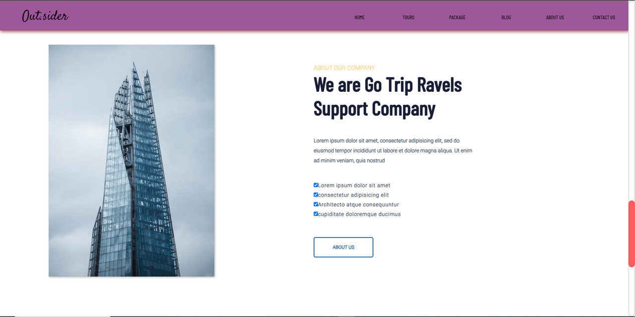
<section class="about">
<div class="about-img">
<img src="https://images.pexels.com/photos/13965386/pexels-photo-13965386.jpeg?auto=compress&cs=tinysrgb&w=1260&h=750&dpr=1">
</div>
<div class="about-text">
<small>ABOUT OUR COMPANY</small>
<h2>We are Go Trip Ravels Support Company</h2>
<p>Lorem ipsum dolor sit amet, consectetur adipisicing elit,
sed do eiusmod tempor incididunt ut labore et dolore magna aliqua.
Ut enim ad minim veniam, quis nostrud</p>
<label><input type="checkbox" checked>Lorem ipsum dolor sit amet</label>
<label><input type="checkbox" checked>consectetur adipisicing elit</label>
<label><input type="checkbox" checked>Architecto atque consequuntur</label>
<label><input type="checkbox" checked>cupiditate doloremque ducimus</label>
<a href="#">ABOUT US</a>
</div>
</section>
<!--===========Footer=================-->
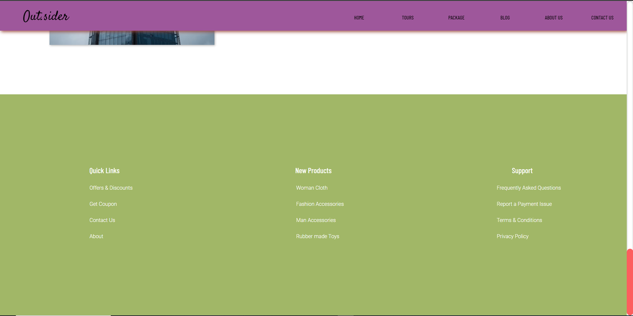
<div class="footer">
<div class="links">
<h3>Quick Links</h3>
<ul>
<li>Offers & Discounts</li>
<li>Get Coupon</li>
<li>Contact Us</li>
<li>About</li>
</ul>
</div>
<div class="links">
<h3>New Products</h3>
<ul>
<li>Woman Cloth</li>
<li>Fashion Accessories</li>
<li>Man Accessories</li>
<li>Rubber made Toys</li>
</ul>
</div>
<div class="links">
<h3>Support</h3>
<ul>
<li>Frequently Asked Questions</li>
<li>Report a Payment Issue</li>
<li>Terms & Conditions</li>
<li>Privacy Policy</li>
</ul>
</div>
</div>
</body>
</html>
02. CSS File :-
import google fonts.
@import url('https://fonts.googleapis.com/css2?family=Barlow+Condensed:wght@500&display=swap');
@import url('https://fonts.googleapis.com/css2?family=Satisfy&display=swap');
@import url('https://fonts.googleapis.com/css2?family=Roboto:wght@300&display=swap');
* {
box-sizing: border-box;
margin: 0;
}
body, html {
margin: 0;
padding: 0;
}
/*------------------------Scroll Bar-----------------------*/
::-webkit-scrollbar {
width: 20px;
}
::-webkit-scrollbar-track {
box-shadow: inset 0 0 5px rgb(162, 168, 162);
border-radius: 10px;
}
::-webkit-scrollbar-thumb {
background-color: #fd5e5e;
border-radius: 10px;
}
::-webkit-scrollbar-thumb:hover {
background-color: #c4aa00;
}
/*========================Nav Bar=========================*/
.nav-bar {
display: flex;
flex-flow: row wrap;
width: 100%;
height: 90px;
background-color: #9e579b;
box-shadow: 3px 3px 10px rgb(151, 70, 55);
align-items: center;
justify-content: center;
position: sticky;
top: 0;
z-index: 1;
}
.logo {
flex: 1;
font-size: 40px;
padding: 20px;
margin-left: 50px;
font-family: Satisfy;
}
ul.menu {
flex: 1;
display: flex;
flex-flow: row wrap;
}
.menu li {
flex: 1;
list-style-type: none;
font-size: 16px;
font-family: "Barlow Condensed";
text-align: center;
}
.menu li a {
text-decoration: none;
color: #000;
text-transform: uppercase;
}
.menu li a:hover {
color: midnightblue;
text-decoration: underline;
}
/*=============================Banner=============================*/
.banner {
background-image: url("https://res.cloudinary.com/dxssqb6l8/image/upload/v1605294054/young-woman-enjoying-beautiful-scenery-of-lago-di-braies-italy-picjumbo-com_aa0fvw.jpg");
background-size: cover;
background-repeat: no-repeat;
background-position: center;
/*overflow: hidden;*/
width: 100%;
height: 100vh;
text-align: center;
position: relative;
display: flex;
justify-content: center;
align-items: center;
}
.banner::before {
content: '';
position: absolute;
display: block;
top: 0;
left: 0;
bottom: 0;
right: 0;
background-color: rgba(76, 199, 113, 0.2);
/*background-size: 100%;*/
}
.banner-text-item {
position: absolute;
width: 100%;
text-align: center;
display: flex;
flex-flow: column wrap;
justify-content: center;
align-items: center;
}
.banner-heading {
flex: 1;
}
.banner-heading h1 {
font-size: 100px;
font-weight: normal;
color: #fd2f2f;
font-family: Satisfy;
}
.banner-text-item .form {
flex: 1;
display: flex;
flex-flow: row wrap;
justify-content: center;
align-items: center;
background-color: rgba(75, 132, 170, 0.2);
border-radius: 5px;
width: 70%;
padding: 1% 2%;
}
.banner-text-item input,
.banner-text-item .date,
.banner-text-item .book {
padding: 15px;
margin-right: 10px;
font-size: 18px;
font-family: Roboto;
border-radius: 5px;
outline: 0;
border: none;
}
.banner-text-item input {
width: 50%;
flex: 2;
}
.banner-text-item .date {
width: 20%;
flex: 1;
}
.banner-text-item .book {
width: 20%;
flex: 1;
}
.banner-text-item .book {
text-decoration: none;
color: #000;
text-transform: uppercase;
padding: 15px;
cursor: pointer;
background-color: #FDE02F;
font-size: 16px;
font-weight: normal;
font-family: "Barlow Condensed";
width: 20%;
}
/*===========================Services===========================*/
.services {
display: flex;
flex-flow: row;
align-items: center;
justify-content: center;
}
.service-item {
flex: 1;
padding: 50px 10px;
border: lightcyan solid 1px;
text-align: center;
margin: 180px 50px;
transition: all 1s;
display: flex;
flex-flow: column;
align-items: center;
justify-content: center;
}
.service-item:hover {
box-shadow: 3px 3px 20px lightsteelblue;
}
.service-item h2 {
font-family: Barlow Condensed;
font-size: 18px;
width: 120px;
color: #001F38;
flex: 1;
}
.service-item img {
width: 60px;
height: 60px;
flex: 1;
}
/*=============================Places===============================*/
.places-text {
text-align: center;
margin-bottom: 50px;
}
.places-text small {
font-family: Roboto;
color: #FFC342;
font-size: 15px;
font-weight: bolder;
}
.places-text h2 {
font-family: Barlow Condensed;
font-size: 55px;
color: #191D34;
letter-spacing: 1px;
}
.cards {
display: grid;
grid-template-columns: repeat(3, 1fr);
grid-template-rows: repeat(2, 1fr);
grid-gap: 30px;
align-items: center;
justify-items: center;
text-align: center;
}
.card {
border: 1px solid lightgray;
box-shadow: 2px 2px 6px 0 rgba(0, 0, 0, 0.3);
border-top-left-radius: 8px;
border-top-right-radius: 8px;
width: 80%;
height: auto;
}
.card img {
max-width: 100%;
height: 300px;
border-radius: 8px;
cursor: pointer;
}
.cards .text {
padding: 20px;
font-family: Barlow Condensed;
line-height: 50px;
}
.cards .card-box {
display: flex;
flex-flow: row;
background-color: #FDE02F;
font-size: 18px;
font-family: Roboto;
align-items: center;
justify-content: center;
text-align: center;
}
.cards .time {
flex: 1;
}
.cards .location {
flex: 2;
}
.cards .cost {
color: #4CAFAD;
font-size: 20px;
}
/*------------Zoom in Photos--------------*/
.zoom-img {
float: left;
position: relative;
width: 100%;
height: 320px;
overflow: hidden;
}
.zoom-img .img-card {
position: absolute;
overflow: hidden;
}
.img-card img {
-webkit-transition: 0.8s ease;
transition: 0.8s ease;
}
.card:hover .zoom-img img {
-webkit-transform: scale(1.1);
transform: scale(1.1);
}
/*=========================About Us=========================*/
.about {
display: flex;
flex-flow: row wrap;
align-items: center;
justify-content: center;
padding: 150px;
}
.about-img {
flex: 1;
}
.about-img img {
width: 500px;
height: 700px;
box-shadow: 2px 2px 6px 0 rgba(0, 0, 0, 0.3);
}
.about-text {
flex: 1;
/*width: 100px;*/
display: flex;
flex-flow: column wrap;
}
.about-text small,
.about-text p,
.about-text input,
.about-text a {
flex: 1;
font-family: Roboto;
}
.about-text small {
color: #FFC342;
font-size: 18px;
}
.about-text h2 {
flex: 1;
font-family: Barlow Condensed;
font-size: 60px;
color: #191D34;
width: 450px;
}
.about-text label {
padding-bottom: 10px;
color: #506172;
font-weight: bolder;
font-family: Roboto;
letter-spacing: 1px;
}
.about-text p {
width: 500px;
line-height: 30px;
color: #506172;
font-weight: bolder;
padding: 50px 0;
}
.about-text a {
background-color: #fff;
border: 2px solid #014B85;
text-decoration: none;
border-radius: 5px;
width: 180px;
padding: 20px;
text-align: center;
margin-top: 50px;
color: #014B85;
font-weight: bolder;
font-size: 14px;
}
.about-text a:hover {
background-color: #014B85;
color: #fff;
}
/*===============Footer===================*/
.footer {
background-image: url("https://res.cloudinary.com/dxssqb6l8/image/upload/v1605293781/pine-tree_mq2sgp.jpg");
background-size: cover;
background-repeat: no-repeat;
background-position: center;
width: 100%;
height: 670px;
position: relative;
display: flex;
flex-flow: row wrap;
justify-content: center;
align-items: center;
}
.footer::before {
position: absolute;
content: '';
display: block;
background-color: rgba(138, 165, 65, 0.8);
top: 0;
left: 0;
bottom: 0;
right: 0;
}
.footer .links {
position: relative;
color: #fff;
flex: 1;
display: flex;
flex-flow: column;
justify-content: center;
align-items: center;
}
.links ul {
list-style-type: none;
}
.links h3 {
font-family: Barlow Condensed;
font-weight: normal;
font-size: 23px;
margin-bottom: 15px;
}
.links li {
font-family: Roboto;
cursor: pointer;
padding: 15px 0;
}
.links li:hover {
color: #FFA801;
}
/*==========================Responsive=============================*/
@media all and (max-width: 1172px) {
.banner-text-item .form {
display: flex;
flex-flow: column;
justify-content: center;
align-items: center;
width: 50%;
}
.banner-text-item .form input,
.banner-text-item .form .date,
.banner-text-item .form a {
flex: 1;
margin-bottom: 5px;
font-size: 14px;
}
.banner-text-item .form input {
width: 60%;
}
.banner-text-item .form .date {
width: 30%;
}
.banner-text-item .form .book {
width: 10%;
font-size: 14px;
}
.banner-heading h1 {
font-size: 60px;
}
}
@media all and (max-width: 1414px) {
.banner-text-item .form input {
width: 40%;
}
.banner-text-item .form .date {
width: 30%;
}
.banner-text-item .form .book {
width: 20%;
font-size: 14px;
}
}
@media all and (max-width: 942px) {
.nav-bar {
display: flex;
flex-flow: column wrap;
justify-content: center;
align-items: center;
width: 100%;
height: auto;
text-align: center;
position: static;
}
.logo {
flex: 1;
font-size: 30px;
margin: 10px auto;
font-family: Satisfy;
color: #FDE02F;
}
.nav-bar ul {
display: none;
}
.nav-bar ul li {
flex: 1;
margin-bottom: 5px;
font-size: 14px;
}
.services {
display: flex;
flex-flow: column wrap;
}
.services .service-item {
flex: 1;
margin-bottom: -130px;
width: 400px;
}
.places-text {
margin-top: 200px;
}
}
@media all and (max-width: 928px) {
.banner .form input, a {
font-size: 12px;
}
}
@media all and (max-width: 1173px) {
.banner .form {
background-color: transparent;
}
}
@media all and (max-width: 1194px) {
.places .card-box p {
font-size: 14px;
}
}
@media all and (max-width: 1086px) {
.places .cards .text {
line-height: 40px;
}
.cards .text .h2 {
font-size: 12px;
}
.cards .img-card img {
height: 260px;
}
}
@media all and (max-width: 974px) {
.cards {
display: grid;
grid-template-columns: repeat(1, 1fr);
grid-template-rows: repeat(6, 1fr);
grid-gap: 20px;
}
.card {
width: 300px;
height: 500px;
margin: auto;
}
.cards .text {
padding: 5px;
font-family: Barlow Condensed;
}
}
@media all and (max-width: 1334px) {
.about-img img {
width: 300px;
height: 500px;
}
}
@media all and (max-width: 1116px) {
.about {
display: flex;
flex-flow: column wrap;
justify-content: center;
align-items: center;
}
.about-img {
flex: 1;
margin-bottom: 20px;
}
.about-text {
flex: 1;
margin: auto;
text-align: center;
display: flex;
flex-flow: column;
justify-content: center;
align-items: center;
}
.about-text h2{
font-size: 35px;
}
.about-img img {
width: 400px;
height: 400px;
}
}
@media all and (max-width: 708px) {
.footer{
width: 100%;
height: 670px;
position: relative;
display: flex;
flex-flow: column wrap;
justify-content: center;
align-items: center;
}
}
Result :-
Download Ebooks – Click Me
Download Notes – Click Me


![Create Flipkart Clone using html and css with source code [Free]](https://i0.wp.com/i.postimg.cc/wxthHzcR/Flipkart-clone-codejuster.jpg?w=0&resize=0,0&ssl=1 "Create Flipkart Clone using html and css with source code [Free]")